bloomfuel
bloomfuel
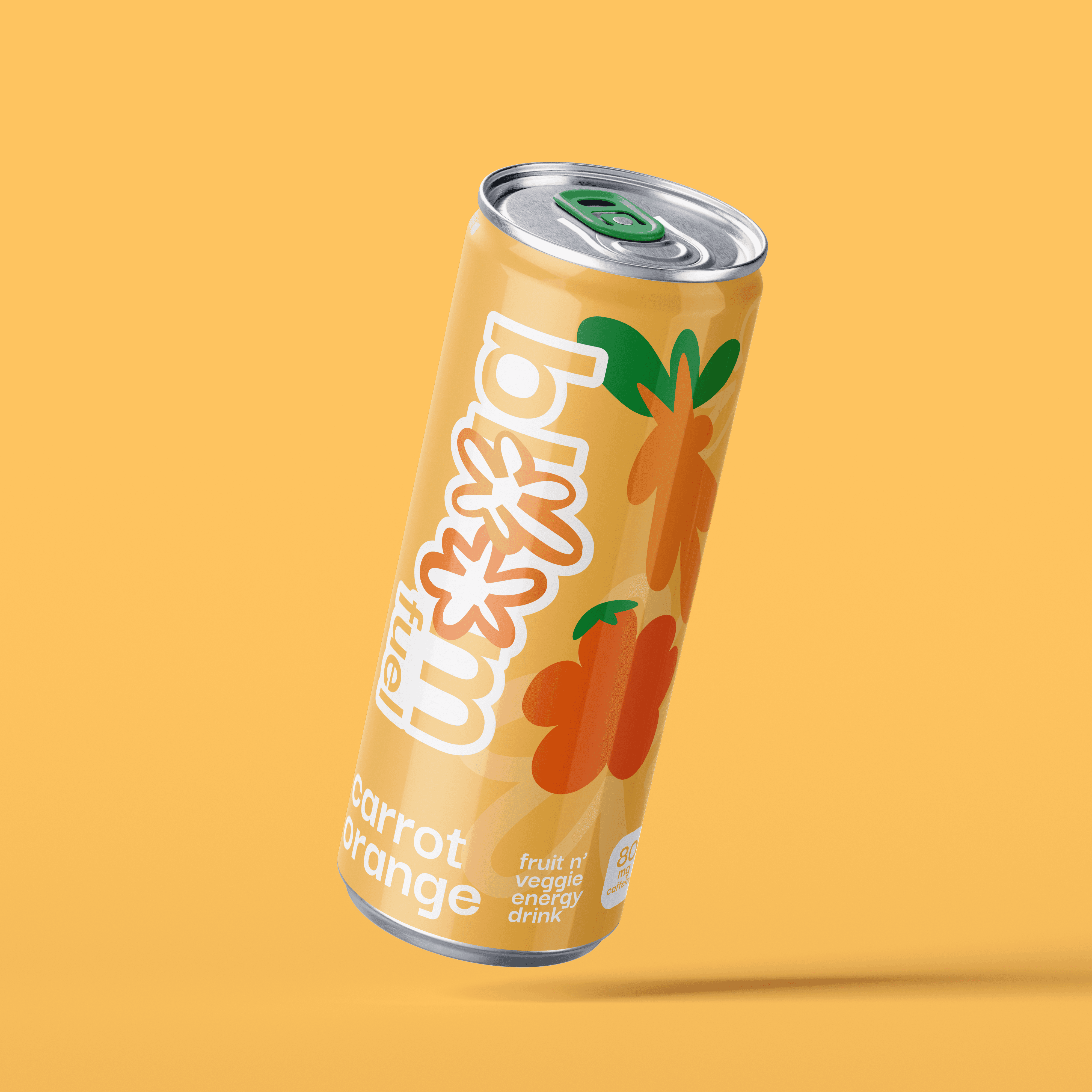
Bloomfuel is an energy drink made with a mix of real fruit & vegetable juices.
Bloomfuel is a personal project for a 16 fl oz low-caffeine canned energy drink that offers a healthier and natural boost of energy. It's made with locally and ethically sourced produce, including imperfect, oddly shaped fruits and veggies that would otherwise go to waste. Bloomfuel delivers vitamins, fibre, and flavour through its nutrient-rich pulp and juice blend.
branding!
branding
advertising
beverages
12 weeks
Brand Purpose
Bloomfuel exists to challenge how we value food and fuel the body using what’s already good, not what looks perfect. Ingredients are sourced locally and ethically, using fully edible but imperfect produce to reduce food waste. This commitment inspired Bloomfuel’s “lumpy supermarket” visual language, with organic forms reflecting the fruits and vegetables inside.
Essentials
1 : Colours
#fec55f
#1d9146
#b1d9a0
#f287b6
#ddb897
The colours reflect the produce present in each juice blend, with orange being the main colour as it was the first flavour I designed. The pastel colour was chosen meticulously to be light while being accessible. The lightness of the colours also reflect the reduced calorie content, representing a “lighter” energy drink.

Green pull tabs representing fruit and vegetable leaves poking out from the soil and flowers they come from.

Stamps on box and documents akin to produce stickers.

Mascots elevating the fun factor in the overall brand, representing the flowers and the sun they depend on.

Fun, quirky cards, intentionally friendly and personal.

Language used in branding on the casual side to prevent alienating consumers and to resonate with the younger audience that consumes energy drinks.
Key Features
2 : Lumpy Fruit Designs
In order: Orange, beetroot, strawberry, ginger, apple, lemon, cucumber, carrot. Stylized with curves and lumps that were intuitive to reinforce making each shape unique. All "round" fruit, like the citrus in this case, follow the same shape with differing colours and sizes.
Brand Applications
1 : The Can
The main star of the show and vessel of communication.
Centerpiece of all of our branding

2 : The Poster
Indicator to suggest consumers to drink Bloomfuel instead of any other juice based drink, essentially.

3 : The Gift Card
Casual, and oriented towards people who work in groups, or are already fans of Bloomfuel. The Os are stylized and replaced by the main icon.

4 : The billboard
Made to spread general curiosity about the brand by not exactly labelling it as an energy drink, but making quips about its flavours.

5 : The stickers
Modeled after stickers places of produce at grocery store. For stamps (certification) as as merch.
Gallery